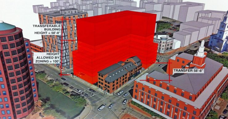

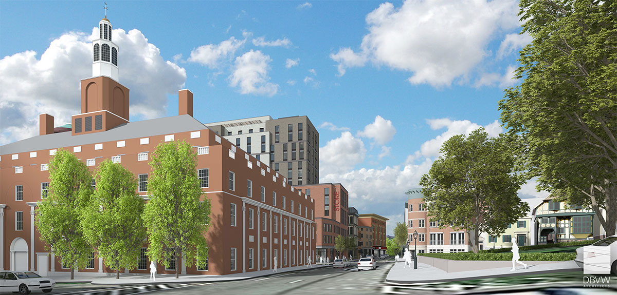
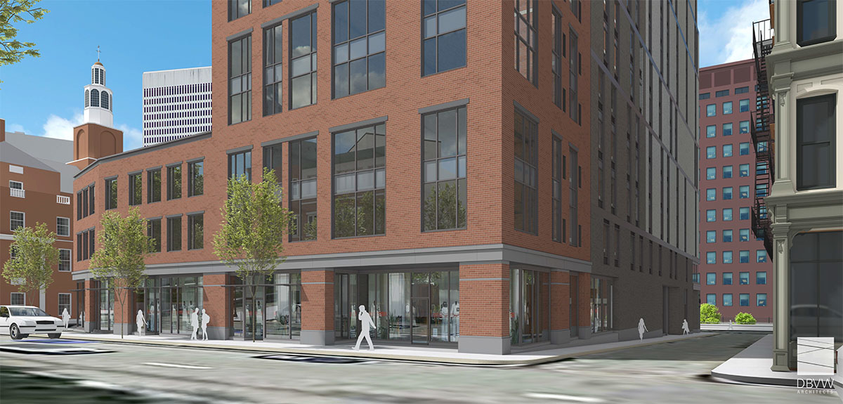
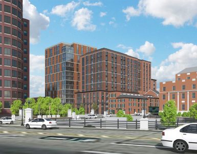
Massing model of proposed Edge College Hill Two. The first Edge College Hill building under construciton now is rendered to the left. DBVW Architects
While the 15-story Edge College Hill building is currently under construction on Canal Street, a proposal for a second 15-story building (Edge College Hill Two), will be heard by the Downtown Design Review Committee on Monday, January 8th.
Providence Business News reports on the proposal:
The application by Steeple Street RI LLC would place the Edge College Hill Two building at 131 Canal St., with frontage on Canal, Elizabeth and North Main streets, and wrapping around the historic Congdon & Carpenter building.
The development pursued by Vision Properties, of Conshohocken, Pa., would require development rights transferred from the adjoining historical building to reach the proposed height of 15 stories.
[…]Michael Viveiros, a principal at the firm, said the building would feature one-bedroom and efficiency apartments, but with larger footprints than the micro-units to be offered in the first building.
The two new buildings would not be mirror images in design. “We’re making a design very specific to the neighborhood and addressing what is a changing scale [in Providence],” he said.
The first thing to note, the image at the top of the post is a massing model, not a rendering as PBN identified it in their story. There is an important difference.
The project is asking to transfer development rights at Monday’s DRC meeting. If the Congdon & Carpenter buildings (the historic ones on the corner of Steeple and Canal, where Fat Belly’s used to be) weren’t there, 100′ buildings would be allowed in their place. Rather than tearing them down (the HORROR!) to attain that development potential, the developer is asking to transfer that potential to the vacant site. If approved, the building would be allowed to rise up to 158′.
The massing model is showing this full development potential. A rendering (which this is not) would show the actual layout of the structure.
I’m all about this potential development, but I would hope the building designed for this site would pull down at the corner of North Main and Steeple to be more in scale with the rest of the buildings at that instersection. A stepback along the lines of what is seen on RISD’s Prov-Wash Building (the one at the bottom right of the image) would be comfortable.
I’m also glad it will not be matchy-matchy with the building already under construction. I’m looking forward to seeing a rendering.
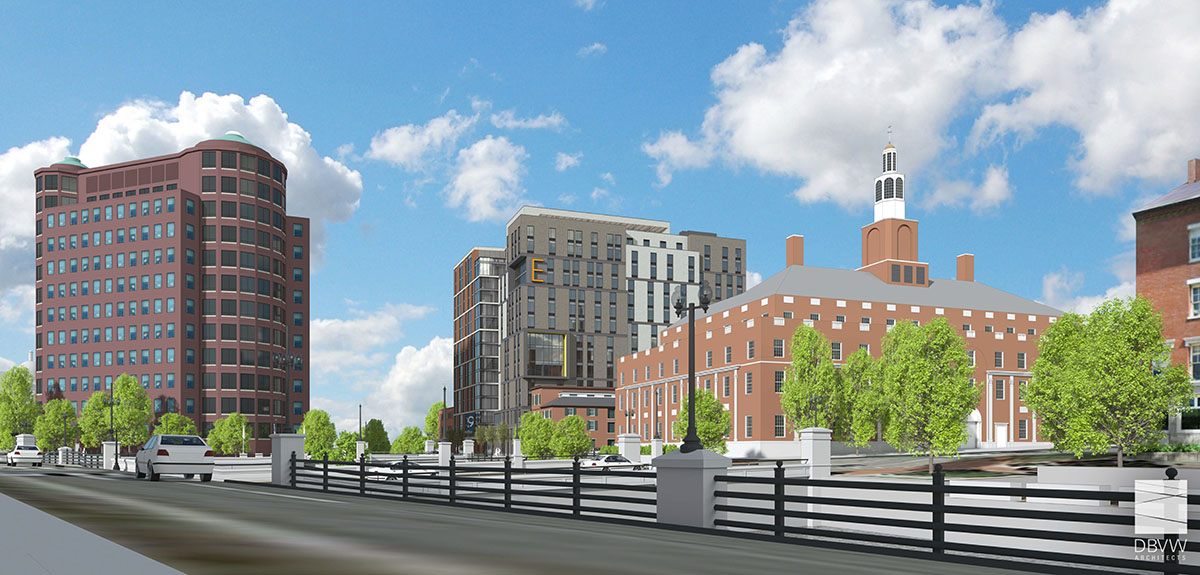
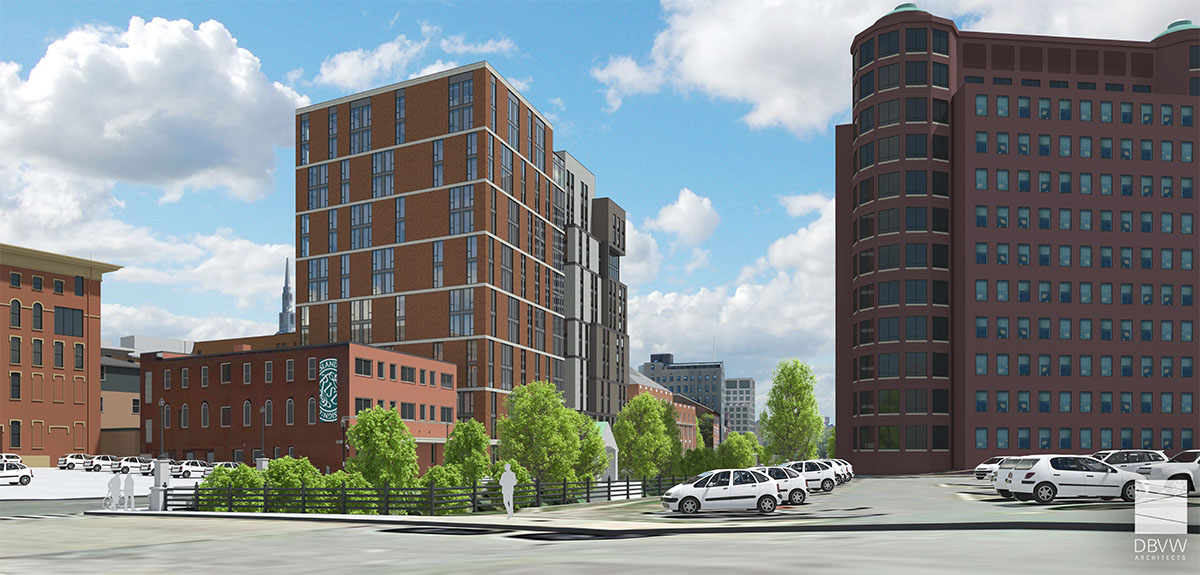
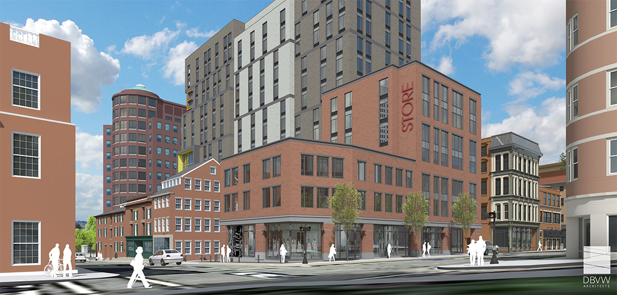
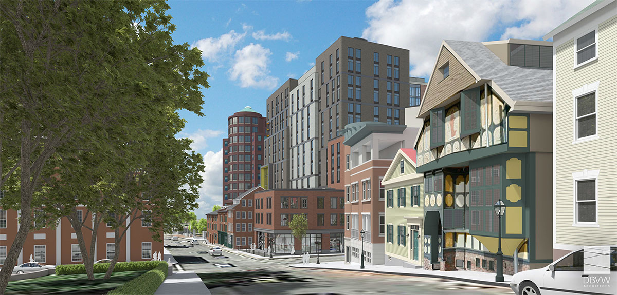
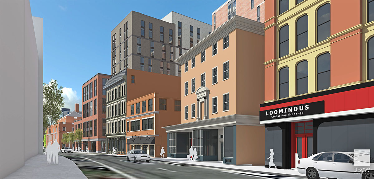
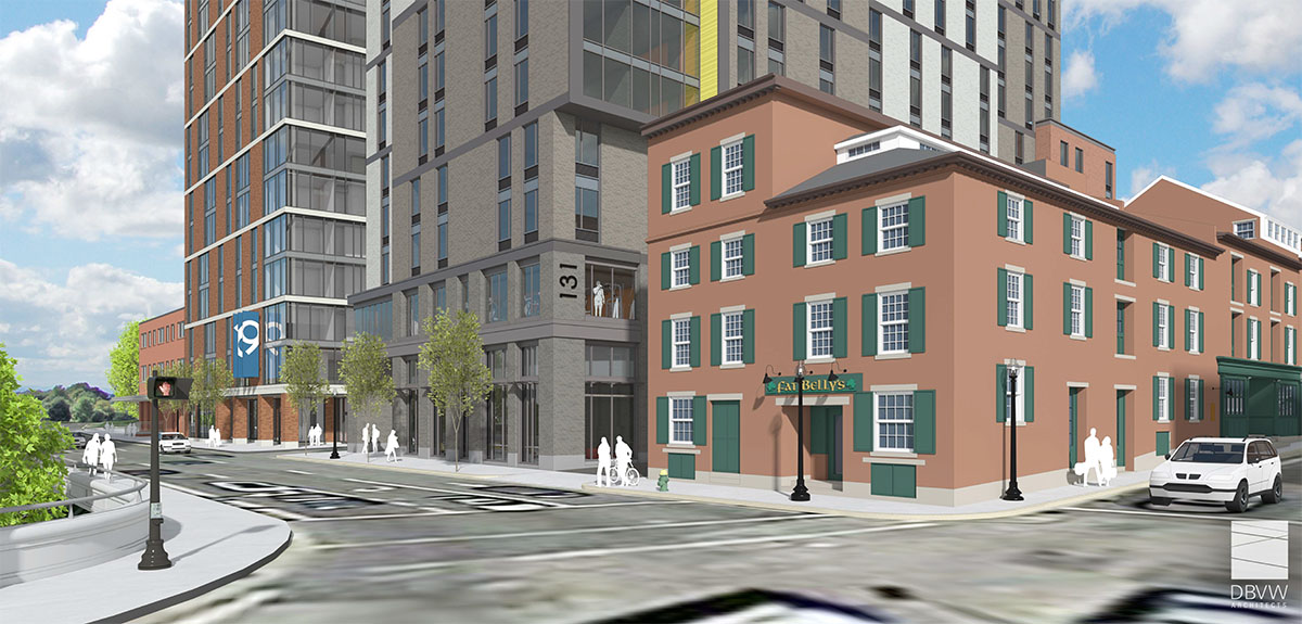
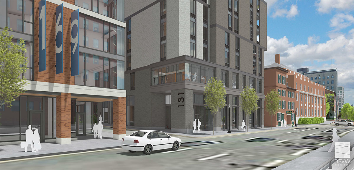
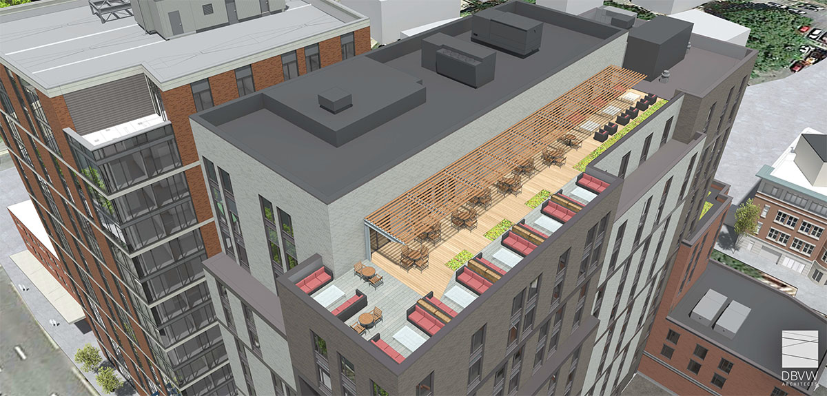
[box style=”red”]On January 24, 2018, the applicant withdrew this proposal from the Downtown Design Review Committee. It is assumed they are going into redesign and will return to the Committee at a later date with a new design. For reference, the images below are renderings from their presentation to the DRC on January 22, 2018 that they have since formally withdrawn from consideration. Renderings are by DBVW Architects.[/alert]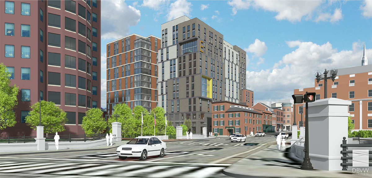

Has there been any mention of parking with this building? Is it geared towards students or non-students?
I would much prefer less footprint and 3-4 more floors…an 18-19 story building.
Isn’t this parcel still a railroad right of way leading to the East Side train tunnel?
Incredibly excited to see another high rise project downtown. I hope that this is just the beginning because there is a lot of demand for downtown residential units. With each project, it adds to the foot traffic of downtown, and that will undoubtedly improve the downtown culture. With the first phase, along with the Homewood Suites project, I wish their was a roof deck or viewing area for WaterFire events. I think that would be a nice feature. I also hope that they will be including ground level retail on the first floor of the second phase.
Let’s rejoice that another surface parking lot in Providence bites the dust. With regards to the railroad ROW, it seems unlikely that any repurposing of the East Side Railroad Tunnel would include a connection to Providence Station. I’d like to see the tunnel be used for transportation, but it would make more sense to embrace a different transportation option. Many cities are using gondolas or trams as a more efficient (and far cheaper) way to move people. Why not run a gondola through the tunnel, stop at Brown, stop at Gano, and cross the Seekonk River to a terminal in East Providence with plenty of parking for commuters. This will help to alleviate alot of travel across the Washington Bridge, which in the morning is madness. That’s a different discussion, though.
I’m sure the “college students” versus “full time residents” argument will be brought up soon, but bringing more people downtown to walk around, frequent businesses, etc. is a good thing. The full time resident high rise buildings will come at some point, I hope.
I love it! Another 227 apartments in that spot adds considerable foot traffic to the area! I have a feeling they’re going to revisit one of the architectural styles they had originally rolled out as options for the first building, but I certainly hope I’m wrong. Is anybody heading to the DDRC meeting today? I’d really love to see the conceptual rendering!
I cannot. But we need folks there to support it – even encourage a smaller footprint and 3-4 floors taller. At least we can all send a email to them NOW.
I agree that this site needs to be sensitive to the surrounding space. It should complement the scale and character of the Providence-Wash, Congdon and Carpenter Buildings, and the others along Steeple Street to the west, even as it transitions to the new Eldridge Hill building to the north. I believe the blocks north of the new Eldridge Hill building are more appropriate for a building of this size, and by merging zoning lots, the developer could probably transfer some of the development rights further north, where a building of this scale would be more appropriate.
The worst outcome would be to build out to the site to its full potential with TDRs, with no setbacks, and with ground floor parking instead of retail space!
I wrote to the DDRC:
DRC Application No. 17.46: 131 Canal Street
This proposed 15-story mixed-use building to be constructed at 131 Canal Street is both consistent and complementary of the existing immediate area. In fact, I would encourage discussion of a possible reduction in footprint and an additional 3-4 stories so as to have an 18-19 floor structure (180-200 feet). Surely, not a tall building for Providence’s downtown.
The taller the structure, the more it will sync the Cancel Street structures to those in the Capital Center, creating a strong and impressive urban density.
I strongly suggest that the DDRC take affirmative action with respect to the requested items.
I have tired of the “too tall, too big” every time a proposal is put forward. It’s downtown Providence!
Another open lot possibly biting the dust, good to see. Really helps close off that side of North Main as well. Now lets get a proposal for the financial district!
I wish there was a public website that visually showed all the projects planned, approved, and under construction…including number of hotel rooms or residential units. There is alot on the drawing board right now and I think since it is not aggregated in a single location, most people don’t understand the amount of progress the City is making. A website would also make Providence more attractive to other out of state developers that see the investment that is being made here. They may not be aware of Providence, the city, the culture, the influx of young people moving here, etc. It would be the perfect “show me” type of marketing campaign.
There has to be close to 2,000+ apartments proposed or under construction at this point, right? Assuming each one has 2 people, that is 4,000 new downtown (or nearly downtown) residents. On a percentage basis, that is huge. Let’s keep this momentum going!
There is this site. I can’t vouch for the accuracy but seems pretty up to date.
https://pvdgis.maps.arcgis.com/apps/webappviewer/index.html?id=d98b58076391485baf3550616817c0c7
You can also access it through the city’s website – http://www.providenceri.gov/
Under Doing Business then Construction.
There is also this website: http://www.jewelrydistrict.org/projects-progress.html
It only shows development in the Jewelry District, but would love to see it expand to the erst of the city.
I would respectfully disagree with the premise that this site is “downtown.” It is between College Hill and Canal Walk, or at least what should be Canal Walk – I can’t for the life of me understand why the City hasn’t done more to link the existing promenade to Roger Williams Park, particularly with all the development on Canal between Steeple and Park Row.
I would also would not be a fan of a tall tower in the middle of a mini plaza. I would much rather see an extension of the curtain-wall façade that runs along Canal Walk from College Street to the Congdon & Carpenter Building (with setbacks above), which is arguably one of the most architecturally rich collections of buildings in the City, and clearly one of the most visible. I think a larger building along Park Row would relate better to development in the Capital District, especially if something of comparable mass were to be built along Park Row on the Citizens parking lot. It’s not about “too tall, too big” as it is about context. There are plenty of sites that really are downtown where bigger and taller would really work.
The site is very much downtown…that is why it is under review by the Downtown Design Review Committee.
However, I fully agree with you that a larger building along Park Row would relate better to development in the Capital District, especially if something of comparable mass were to be built along Park Row on the Citizens parking lot.
My view is do what you say AND expand that scale along Canal, South Main, and of course on the other side along Dyer Street down to Point Street.
I’ve been scouring the internet trying to find if any photos of the conceptual rendering popped up, but to no avail. Has anybody seen anything?
I think you hit every point on the head, Jef!
Thanks for explaining renditions vs. massing height. A scale-back at N. Main and Steeple make reasonable sense. Looking forward to some renderings!
Any word on the DDRC decision on January 8th??
I think it ended up being continued until later this month.
It’s now scheduled for 1/22 @ 4:45pm.
Any word on the DDRC decision on January 22nd??
It was continued. They weren’t sure if the next full committee meeting on this was going to be in February. They have a 90 day window for the next meeting. There is a possibility of a subcommittee meeting to work out the issues of scale and design.
This was my first time going to one of these meetings. It was interesting. I’ve included a link to a previous version of the design concept presentation. The latest one was tweaked a bit to match some roof line detail on the historic buildings next to it. On one view you can see what looks like a wide plaza. It is not as wide as it looks. The plaza is 8′ wide. The presentation at the meeting included other details like a service ally between the historic building and this building along with some floors plans.
Like it’s cousin next door it is aimed at graduate and recently graduated students. Small apartments. No parking.
There was public comment. One person for and quite a few NIMBY. Everyone new everyone so it seems like a small group of people influence everything. The next full committee meeting may or may not have public spoken comments depending on what the lawyers decide. I didn’t understand that part but I think they may go to written comments instead of spoken.
Overall I think they did a nice job with the scale of the building and the wavers they are seeking make sense given what they could build there. One of the public comments is that it looks “prison like”. That is the same though I had when I first saw the coloration of the tower part. I’m interested to see what other people think of the design.
I any event, it is worth going to no matter what side you are on.
https://www.dropbox.com/s/tgdew6f0t0zzge7/1722_DDRC-Pictures_only_Package_17-1218_copy.pdf?dl=0
PBN Story
Man, I’m not gonna lie. I kind of hate it.
The North Main stretch is cohesive. It might not be inspiring, but it fits in, and looks like one solid form. Were it an individual structure, I’d be very content with its presence in the neighborhood.
Pardon my language, but the rest of the structure is some drab bullshit with Ikea accents thrown in.
Look, I’m not gonna say that every building needs to be red brick or anything, and that’s not why I like the North Main section of this building over the rest of it. It’s just that the majority of this structure lacks any cohesion. It’s sloppy, and it’s boring. If you take the context that this building will exist in, a lot of the buildings have the common material of brick, even the structure they’re building next door, but even the ones that vary are visually pleasing, and warm, in a sense. This concept throws all of that out the window. It towers over the neighborhood, shares nothing in common, and doesn’t justify it’s differentiation by being aesthetically pleasing in any significant way.
I know this is the conceptual rendering, but there’s no narrative here. I’d even prefer a mostly glass curtain facade to this, because at least there would be two structures of similar size nearby that bridge the gap on its behalf by combining warm tones and high gloss.
Maybe I’m being a bit harsh here. It’s not beyond saving. There is a white church across the way, there are white accents on structures nearby, and One Financial Plaza is white with vertical windows. Perhaps it could whiten and expand those light grey sections? Maybe it could just generally tighten up it’s style, so it’s not all over the place? I don’t know. It just seems like a bad fit there. I could see this in the Jewelry District, but not here.
Am I alone on this?
The applicant has withdrawn their application. It could be assumed that they will go into redesign and bring it back at a later date.
I generally agree with David in terms of the drab gray Institutional (Elderly High Rise Housing) look.
But, I certainly hope they come back with a brick or brick like design more fitting for the immediate area…and smaller footprint- taller tower.
I’ve been looking these renderings over, and considering my criticisms from before. I may have been a bit harsh in terms of my wording. It’s just that with a project of this mass, in the location they’re looking to put it, they’re going to have to win folks over a bit with the design.
I appreciate that they seem to have wanted to do something new in this space, and I’m sure the financial constraints, in addition to the desire to visually break up the mass of the building, led to the design choices, but in the end, it just seems mostly formless. It has the same effect as tv static, or a dazzle of zebras, you can’t tell where anything really begins or ends. All of the vertical lines are broken up, and all the horizontal lines are broken up, with the exception being the section that faces North Main. Whereas the Waterplace condos succeeded in breaking up their mass by using lines and materials to give the appearance of almost separate structures entirely, this one seems to aim to confuse you into not really registering what the actual form is that you’re looking at.
Look at their first structure going up now. Most of the vertical lines on that one are broken up too, but there is the one glass corner that shoots all the way up, which makes it the visual center in that orientation, much like how the IGT building has its own, even though it’s only visible fifty percent of the time. It also has subtle horizontal lines demarking the breaks in the vertical ones. These work as a sort of punctuation. They’re the same color as the sidewalk, and the two thickest bands separate the ground floor from where the residences begin, and finish off at the top, where the residences end. The building is one single structure in appearance. It incorporates elements of the surrounding environment, adds its own visual sort of commentary, has a style, has a size, has an identity. It really is a successful design.
This building has promise. I’m perfectly okay with this building being the size and general shape that it is, but it they want to break up the “wall” effect, I’d suggest doing so in more defined ways, so as to avoid the “tv static” kind of effect.
Let’s say they wanted to stick with the materials and general concept, then they just have to tighten it up. Maintain the vertical line differentiating the dark grey and light grey sections on the Canal street side from top to bottom. I’ve favor expanding the light grey section, but either works, just pick one. On the Steeple street side, if you’re going to break up the matching horizontal lines of the dark grey sections, just abandon the horizontal lines on the light grey section altogether and commit to some vertical lines. I know these suggestions mess with the internal layouts a bit, but surely, it must be workable, since most buildings maintain vertical lines.
If they decide they more or less prefer to maintain the floor plans as they are, then perhaps they should just break up the materials a bit more for greater contrast and definition. There are other options besides brick, too. Weathering steel rusts to a nice warm tone not too different from the color of brick that they use on the building currently being constructed. You could just replace all the dark grey with glass. I don’t know, just something.
I’m not an architect, so I’d probably sound like a jackass to whomever designed this, but I’m just trying to bridge the gap, because I’m fairly certain this would make a terrible first impression to the general public. As I’m sure we’ve all seen from the botched initial Pawsox stadium proposal, once there’s momentum behind a negative reaction in Rhode Island, it tends to stick around far beyond reason. I want this project to succeed, but so far, this is on par with the initial proposal for the triangular parcel.
Last thing, ditch the damn yellow, it’s corny. We get it, you want an “E” on the side. It works better if it’s subtle.
I added what was proposed to the DRC on January 22nd to the original post above. However, note, that this proposal has been formally withdrawn, it is assumed a new design will be submitted at a later date.
I don’t mind it. I actually think that slightly more modern buildings would be a good thing for Providence. Also, this really starts to “complete” North Main Street, and make it more of a walkable area, since you are no longer walking by surface parking lots. Also, the view looking down College Hill is great, it shows an actual linear street going into downtown now.
The lots behind the Citizens Bank building could host taller towers if this developer raised their building height closer to 20 stories. These developers have to start pushing for more vertical with their projects, the actual area inside the 95/195 loop is finite and building 10 story mid-rises close to downtown is just short sighted.
I hope that these developers aren’t cancelling this project.
Fully agree.
The Canal Street site is downtown…this project should be at least 15-20 stories. I am tired of the same old “too tall, too modern, too much…”
Tall is good – very good – for downtown and modern does not equal ugly. The focus should be on design, not height.
I too very much hope this returns in some similar (more brick-like and taller) design.
This is going back to DRC on February 12th for discussion only as an 11-story building.
Very, very disappointing. Same old “small town” mentality argument..too tall, too much. This could have been an 18 floor on Canal and 5 floor on North Main.
I’m bummed that they’re shrinking this down. I hope my earlier comments didn’t come off as anti-modern, it just seemed incoherent to me. I wonder what the reasoning was for scaling it down.d